Why inverting a PDF looks bad
Flipping every colour channel is the obvious way to make a PDF dark. It is also why the result usually looks wrong.
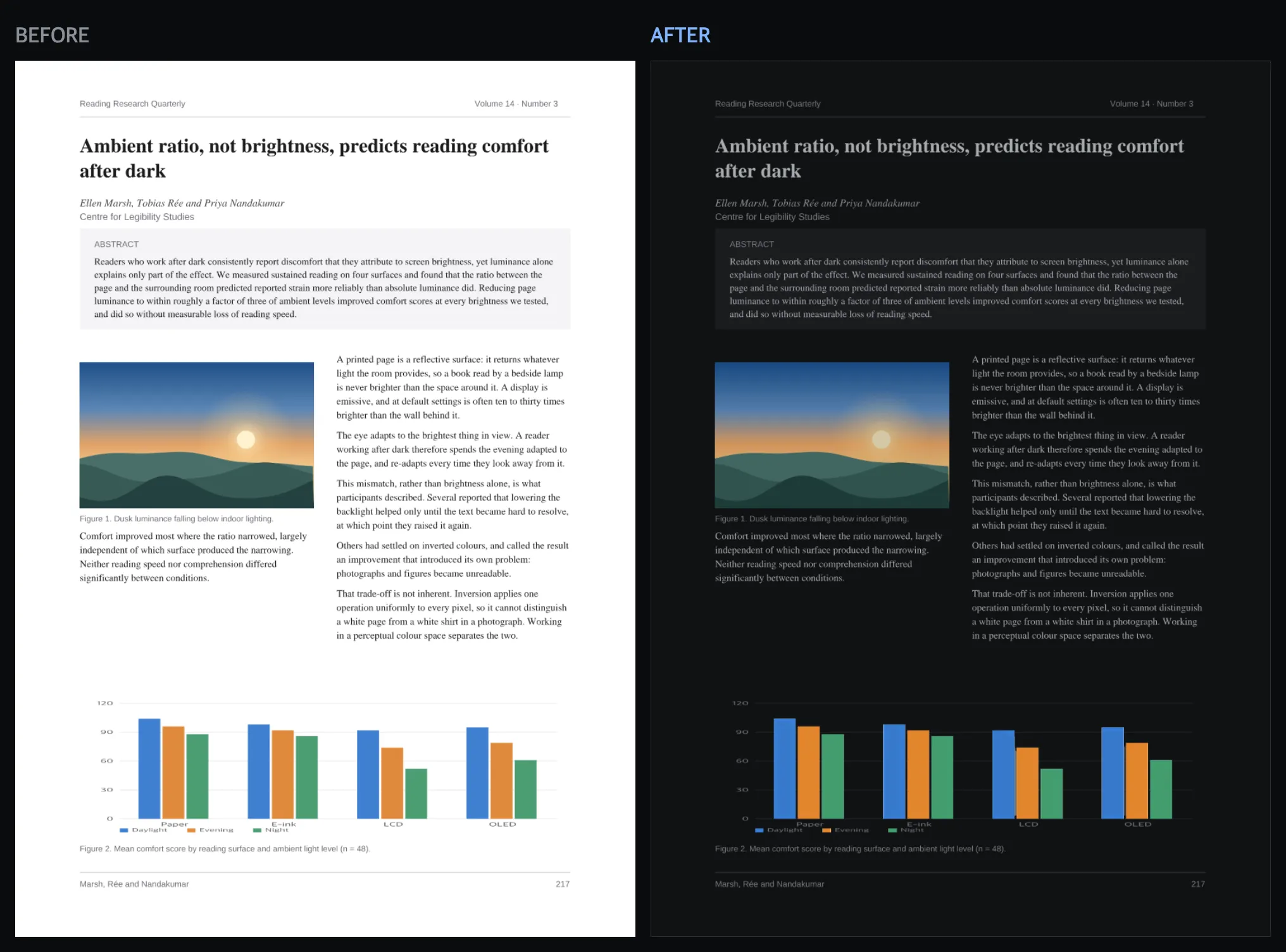
What inversion actually does
The simplest possible way to make a white page dark is to invert every colour: for each red, green and blue channel, replace the value v with 255 - v. White (255, 255, 255) becomes black (0, 0, 0), which is the effect people want. But that same operation is applied to every other pixel on the page too, including the ones inside a photograph.
A photograph is not made of paper-white and ink-black. It is made of thousands of distinct colours, and RGB channel inversion does not just darken those colours — it maps each one to its complement. A warm skin tone shifts toward cold blue-green. A blue sky shifts toward orange. Reds and cyans swap places. The result is not a darker version of the photograph; it is its photographic negative, which is a different image with a different meaning, not a stylistic variant of the same one.
The channel-inversion trap generalises badly
The same problem shows up anywhere a document uses colour deliberately: a brand orange in a logo, a coloured line in a chart, a yellow highlighter stroke. Inverting the channel values does not preserve any of these as “the same colour, but suited to a dark page” — it produces their complements, which usually have no relationship to the original beyond arithmetic. A chart intended to be read against its legend stops matching that legend. A brand colour turns into a colour nobody chose.
The fix is not a better inversion formula. It is recognising that lightness — how dark or light something looks — and hue — what colour it looks like — are separate properties, and only one of them should change.
Perceptual lightness: OKLab and OKLCh
RGB does not separate lightness from hue in any way that matches human perception; channel values are tied to how a screen produces light, not to how a viewer perceives colour. OKLab, published by Björn Ottosson in 2020, is a colour space designed specifically so that a change to its lightness axis (L) looks like a uniform brightness change to a human observer, largely independent of a colour’s hue or saturation. OKLCh is the same space expressed in cylindrical coordinates — lightness, chroma (how saturated) and hue (what colour) — which makes it easier to reason about and adjust one property while leaving the others alone.
Converting a page’s colours in OKLab/OKLCh instead of RGB means lightness can be pushed from “near white” to “near black” — the actual goal of a dark conversion — while a colour’s hue stays fixed. A blue stays some form of blue. An orange stays some form of orange. Nothing gets swapped for its complement.
Three rules, not one formula
Preserving hue is necessary but not sufficient — a single lightness-mapping rule applied to everything still gets neutrals, saturated ink and faint watermarks wrong in different ways. The engine behind this converter uses three distinct rules, chosen for what each kind of colour is actually doing on the page.
Neutrals ride a theme-tinted ramp. Page background and body text are, in almost every document, close to white and close to black. These are mapped onto a ramp between the chosen theme’s background colour and its text colour: source white lands exactly on the theme’s background, source black lands exactly on the theme’s text colour, and every grey in between is interpolated along the same ramp — including the ramp’s hue, so a warm theme’s mid-greys pick up a warm tint instead of floating as cold, out-of-place greys next to it.
Saturated inks keep their lightness. A colour is judged by how chromatic it is — how far it sits from grey. A colour that is clearly saturated, like a brand orange or a chart line, skips the neutral ramp almost entirely: its lightness stays close to what it was in the source document, and its hue and chroma are preserved. A colour that already read clearly on a white page continues to read clearly on a dark one, because it was not forced through the same white-to-black mapping used for body text.
The contrast floor is capped by the source’s own contrast on white. Some colours need a lightness nudge to stay readable against the new background — but only up to the contrast the colour already had against white paper in the original document, never further. A faint grey watermark that was barely visible on the original white page stays faint on the dark one; it is not “fixed” into a distraction that was never part of the document’s design. A colour is only pushed to be more readable than it already was if it would otherwise fail to meet a basic contrast minimum, and even then only as far as it needs to.
Images are classified, not switched
Photographs and scanned text pages need opposite treatment — a photograph should keep its colours, a scanned page of text should go properly dark like any other page — but a document’s images are not cleanly one or the other. A page might contain a photograph with a white margin, or a screenshot with photographic content embedded in it. Treating every image as either “definitely a photo” or “definitely a scan” produces visible mistakes at the boundary.
Instead, every image is scored on a continuous scale from 0 to 1: how much of it is near white, how colourful it is, how rich its palette is, how dark it already is. That score blends two treatments — dimming without inverting at one end, and the same colour mapping used for ink and background at the other — rather than switching sharply between them. An ambiguous image degrades gracefully along that blend instead of flipping unpredictably between two wrong answers.
A dark fill only becomes a background once something sits on it
Some page elements are already correct as they are: a CV with a dark sidebar, an invoice with a coloured header band, a slide with a black backdrop. These already have light text on a dark surface, deliberately, and inverting them on top of a general dark-mode conversion would turn a readable dark block into a light one with unreadable dark text sitting on top of it.
The difficulty is that a dark shape on a page is not obviously a background just because it is dark and reasonably large — a dark bar in a chart is dark and sized similarly, but is not a background and should be treated like any other chart element. The distinguishing signal is not the fill’s own colour; it is what is drawn on top of it. A dark, sizeable fill is treated only as a candidate background until the page is checked for light text or a light image actually positioned over it. Only once that confirmation happens is the region left alone rather than pushed through the normal conversion — a dark chart bar never earns that confirmation, because nothing light is drawn on it, so it is converted like everything else on the page.
Try it
Convert a PDF and see the difference on your own document — the preview is free.